White-Label Wallet
The Partisia ID Wallet is available as a white-label product. Organizations can deploy a fully branded version of the wallet — with their own name, logo, colors, and credential appearance — without building a wallet from scratch.
The white-label wallet is built on Material Design 3 and shares the same codebase as the Partisia ID Wallet, meaning it is kept up to date with all protocol and security improvements automatically.
What Can Be Customized
Customization is organized into two levels: app-level branding and credential-level appearance.
App Branding
The following elements apply globally across the wallet application:
App name and logo: The name displayed on the welcome screen and throughout the app, and the app icon shown on the device home screen.
Color scheme: The entire UI derives from a configurable set of Material Design 3 color roles. The primary color drives buttons, FAB menus, swipe controls, and key interactive elements. Secondary and tertiary colors govern credential card backgrounds, selected states, and instruction sections. Error and success colors are independently configurable.
The configurable color roles are:
| Role | Default | Used for |
|---|---|---|
| Primary | #315DF8 |
Buttons, FAB, swipe controls, active elements |
| On Primary | #FFFFFF |
Text and icons on primary surfaces |
| Primary Container | #333333 |
Credential card information containers |
| On Primary Container | #FFFFFF |
Text on primary containers |
| Secondary | #0E1434 |
Back buttons, secondary actions |
| On Secondary | #FFFFFF |
Text and icons on secondary surfaces |
| Secondary Container | #182156 |
Instruction sections, stacked card backgrounds |
| On Secondary Container | #FFFFFF |
Text on secondary containers |
| Tertiary | #182156 |
Credential card backgrounds, selected states |
| On Tertiary | #FFFFFF |
Text and icons on tertiary surfaces |
| Tertiary Container | #FFFFFF |
Pagination dot backgrounds |
| On Tertiary Container | #858585 |
Inactive pagination dots |
| Error | #BA2509 |
Error messages, delete actions in the app bar |
| On Error | #FFFFFF |
Text and icons on error surfaces |
| Error Container | #F5CEC6 |
Error notification backgrounds |
| On Error Container | #BA2509 |
Text on error containers |
| Success | #5CA700 |
Action confirmations, verification success |
| On Success | #FFFFFF |
Text and icons on success surfaces |
| Success Container | #F6FFEB |
Success notification backgrounds |
| On Success Container | #5CA700 |
Text on success containers |
| Background | #FFFFFF |
App background |
| On Background | #333333 |
Text on background surfaces |
| Surface Container Low | #FFFFFF |
Low-emphasis surface areas |
| Surface Container Lowest | #FFFFFF |
Lowest-emphasis surface areas |
| Surface Container High | #FFFFFF |
Expanded credential attribute surfaces |
| Surface Container Highest | #FFFFFF |
Highest-emphasis surface areas |
| On Surface | #0E1434 |
Primary text and icons |
| On Surface Variant | #333333 |
Secondary text, app bar icons |
| Outline | #858585 |
Borders and outlines |
| Outline Variant | #D4D4D4 |
Dividers between sections |
| Inverse Primary | #182156 |
Inverse primary accents |
| Scrim | #000000 |
Overlay backgrounds |
| Shadow | #333333 |
Drop shadows |
Welcome and onboarding screens: The welcome screen supports a custom logo, app name, and tagline. The multi-step onboarding flow supports custom illustrations or animations per step, and all onboarding text is fully editable.
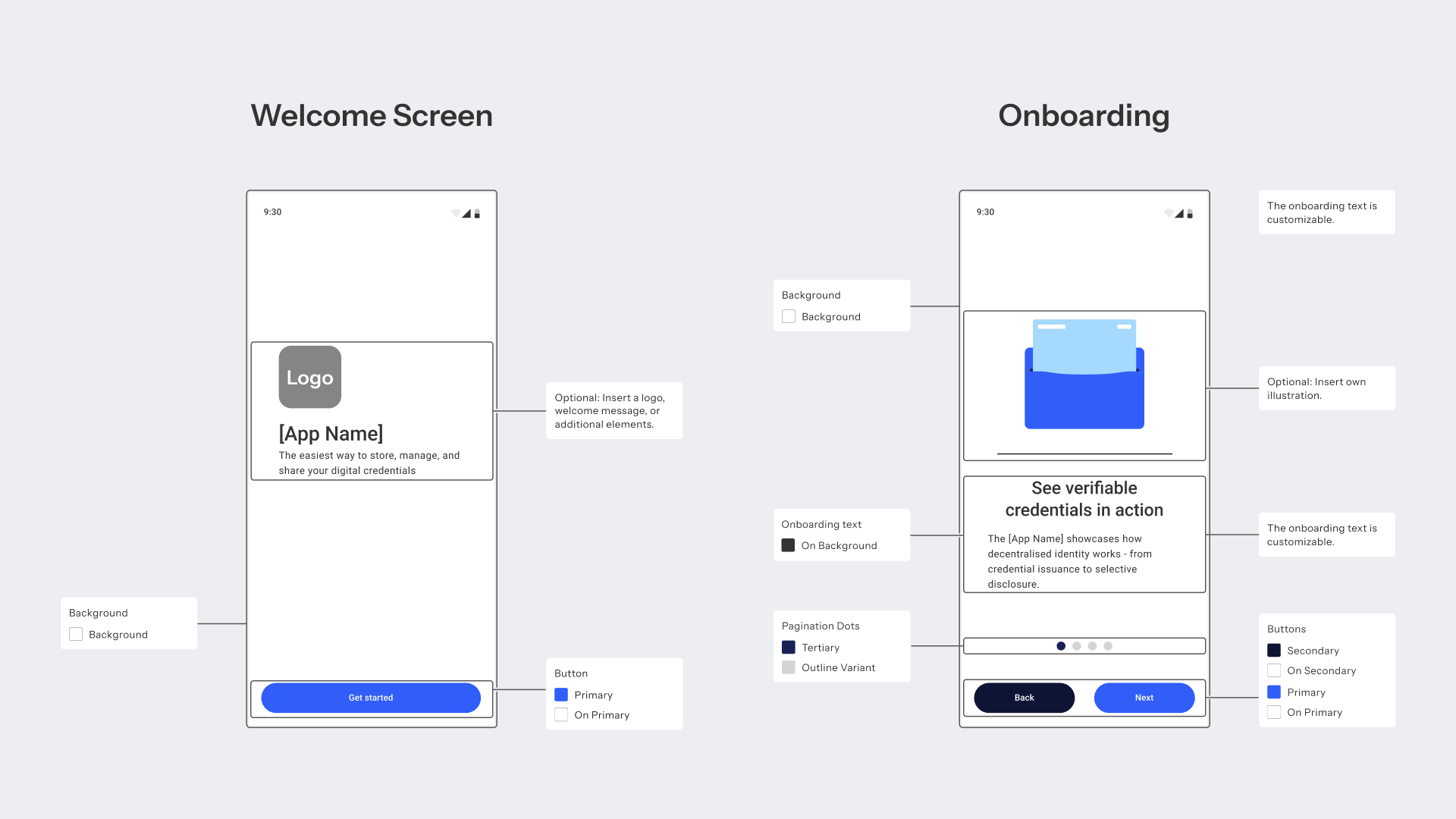
Credential Appearance
Each credential type issued to the wallet has its own visual configuration, independent of the app-level branding. This allows different issuers to have distinct credential designs within the same wallet.
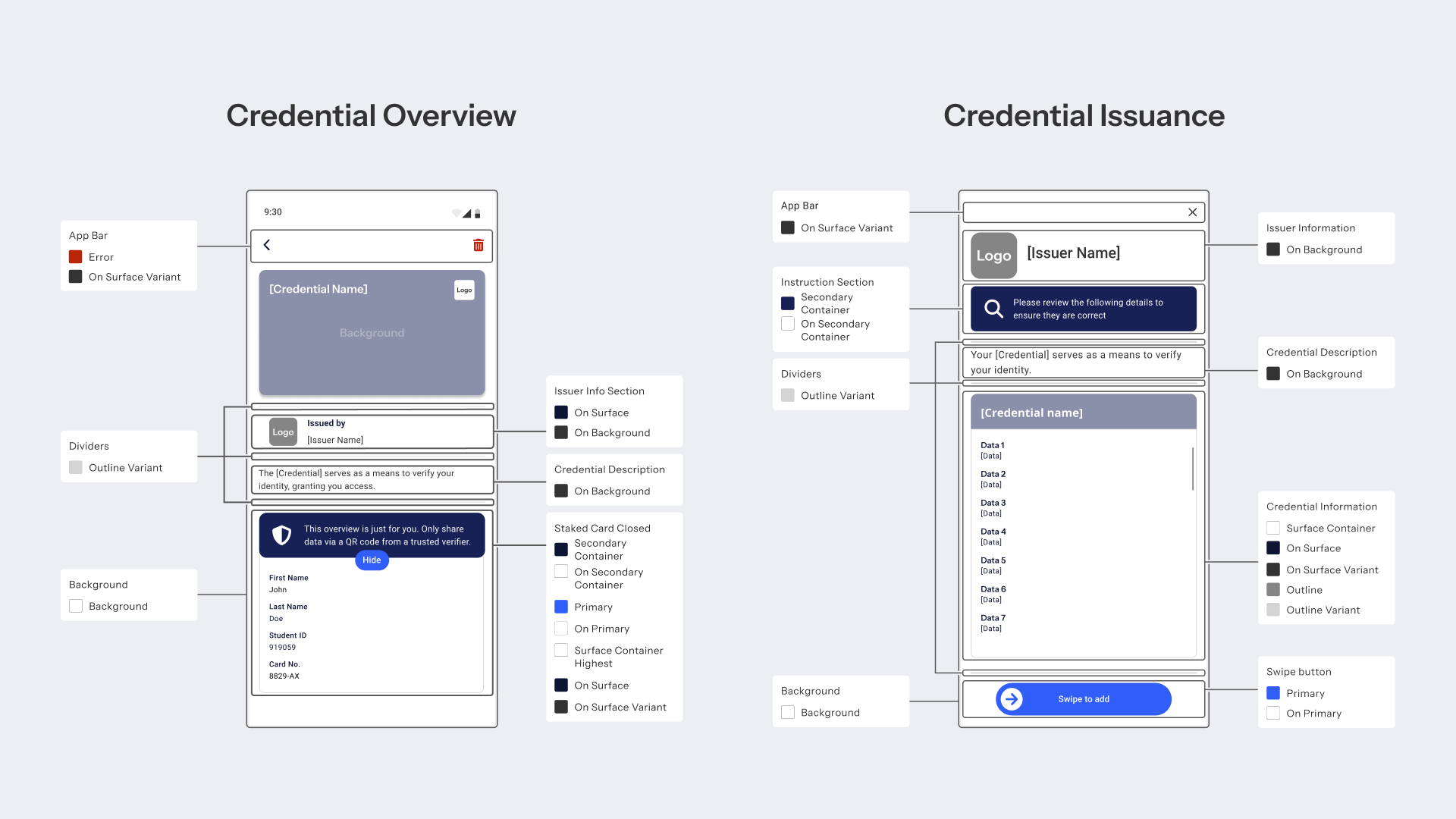
Credential card (the visual shown in the credential overview):
- Title: The credential type name displayed on the card.
- Text color: Color applied to the title and any text overlaid on the card.
- Background color: The primary fill color of the card.
- Background image: A custom graphic or pattern covering the entire card face.
- Optional logo: A secondary logo placed in the top-right corner of the card.
Credential card information (the expanded detail view):
The layout of the detail view mirrors the visual style of the credential card — title, logo placement, and text color are inherited from the card configuration.
Screens Overview
The white-label wallet covers the following screens, all of which use the configured color scheme and branding:
| Screen | Description |
|---|---|
| Welcome Screen | App entry point with logo, tagline, and primary CTA button |
| Onboarding | Multi-step flow explaining credential issuance and selective disclosure |
| Credential Overview | List of stored credentials shown as branded cards |
| Credential Details | Expanded view of a credential with issuer info and attribute disclosure toggle |
| Credential Details Extended | Full attribute view with all credential data fields visible |
| Credential Issuance | Review screen shown before the holder accepts a new credential |
| Credential Added | Confirmation screen after a credential has been successfully stored |
| Credential Verify | Presentation flow triggered by a verifier QR code or deep link |
| Credential Verify Choices | Credential selection when multiple credentials satisfy a request |
| Credential Verify Choices Empty | Shown when no stored credential matches the verifier's request |
| Credential Verify Success | Confirmation that data has been shared with the verifier |
| Credential Error | Error screen when credential retrieval or verification fails |
Getting Started
For the full design specification, see the DID Wallet Whitelabel Design Guide. To discuss a white-label wallet for your organization, book a call with the Partisia team.
What's Next
- Issuer Architecture: How credentials are issued to the wallet.
- Verifier Architecture: How the wallet responds to presentation requests.